


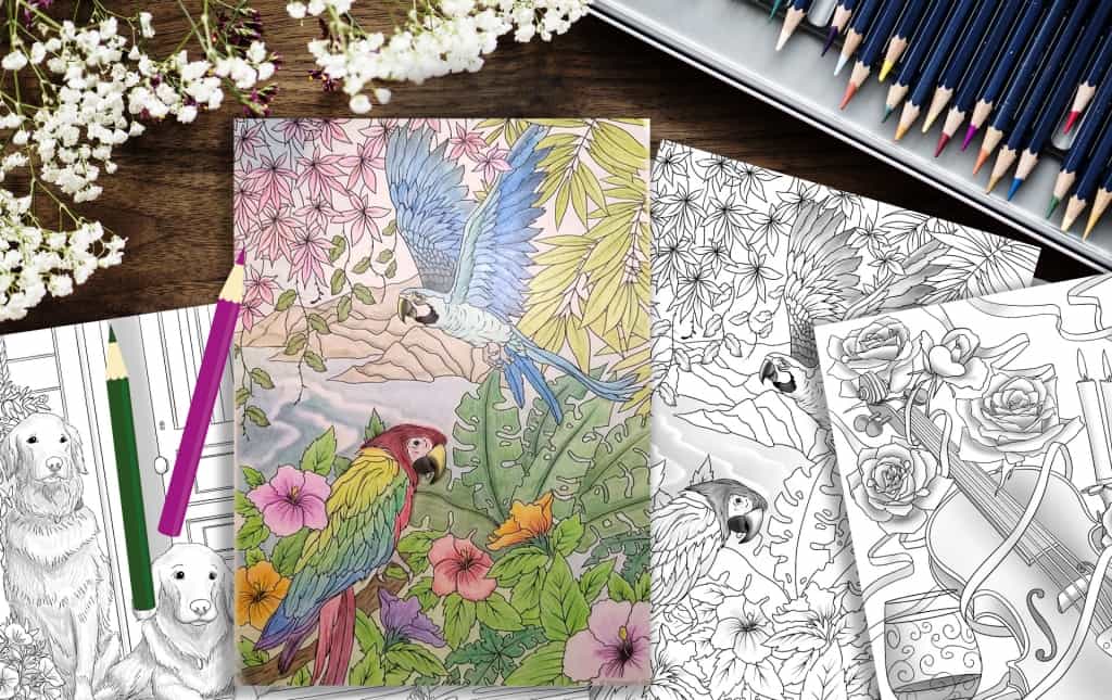
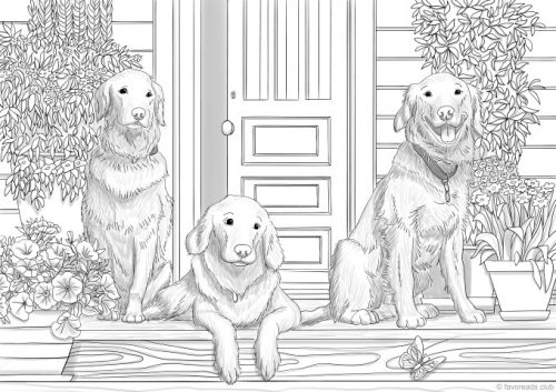
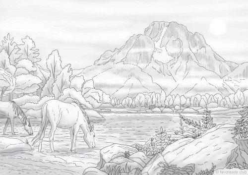
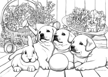
What is grayscale coloring?
Since coloring has become such a popular activity among adults, there appeared a huge variety of designs and techniques. You may have already heard about grayscale coloring or maybe this is the first time you are reading about it. So what is it exactly and why is it getting more and more popular nowadays? Grayscale in its general meaning is a range of gray shades from white to black. This term is often associated with photography. However, when it comes to coloring, grayscale designs are the ones composed exclusively of shades of gray, varying from black with the strongest intensity to white with the weakest intensity. Comparing to traditional adult coloring pages grayscale designs usually look similar to black and white photographs.
If you are used to traditional coloring pages with black lines and white spaces, at first, you may think that grayscale drawings will limit your imagination, since some of their parts are already filled in with color. But that’s actually far from the truth. In this article, we’ll take a closer look at grayscale coloring. Keep reading and you’ll learn the best tips and techniques that will help you create really stunning masterpieces.
Grayscale variations
Basically, you can find 3 different variations of grayscale coloring designs – dark, medium, and light. Depending on your coloring skills you can start with those that you are most comfortable with and work from there. The lightness/darkness of a drawing is really up to your liking because there are lots of different pages with just a few gray touches as well as much darker ones.
Beginner colorists can be a little intimidated by the dark grayscale images. However, it is important to note that they are actually that dark for a reason. The darkness provides depth to the coloring page making it look more like a real drawing. Pages without the shadows may seem flat if a colorist does not use specific techniques to create shadows manually with colored pencils or other tools.
Coloring complexity
Grayscale coloring may only seem complicated, however, all you have to do is color over the image matching the darkness and lightness of your colors to the levels of gray. So in fact, a grayscale design itself does a lot of work for you. When coloring such designs you also don’t have to worry about marker streaks that much, which makes it possible to get away with coloring outside the lines.
Many colorists suggest starting with the darkest area and moving down from there applying less and less pressure to produce lighter strokes. You may color over the dark gray spots of your drawing using any other color apart from gray, or you may leave them gray as they are and begin adding colors by smoothly merging them with gray. Your artwork will end up having a perfect shading either way.
The basic grayscale coloring technique
Remember that when you are coloring over grayscale the gray serves you as a guide, telling you how dark or light your color should be for this particular area and where exactly to apply it. If you’re just a beginner, choose only one color and apply it to the entire gray area of your drawing.
If you like to play with the shades and add more volume to your artworks, pick the pencils with 3 matching tones of the same color. Test them on a spare sheet of paper before you start, trying to arrange all the colors and tones in advance. Then simply apply light colors over light gray, medium colors over medium gray and dark ones over dark gray. While applying the colors you may sometimes notice that the transition from light to dark is gradual. If this happens, you can always fix it by adding more color and blending from light to medium or from medium to dark. You are welcome to stick to your favorite blending method using q-tips, colorless blenders or other blending tools. You can read more about blending in one of our previous posts HERE.
Pencils, markers and other tools
Now that you are well familiar with the basic grayscale coloring technique, you can use pretty much anything, not just colored pencils, although they would probably be your first choice. Markers, watercolor pencils, and pastels will also work rather well. Avoid using gel pens because they are opaque and can completely cover up all the shadows on the drawing. However, you can apply gel pens to small parts of the image to create highlights, or to emphasize some details. A white gel pen works great when it comes to coloring eyes and lips, creating a shiny effect.
The second most popular tools for coloring grayscale designs are markers. If you are ready to experiment, here are some tips for the best results. Select one color for each area and color over the entire area. Apply light colors to the lightest parts and dark colors to the darkest respectively. Just make sure to test the surface of your printable sheet before you start because markers are a very transparent medium, so shadows should still show through. Also avoid using too many dark colors when working with markers, because they can make your colored page seem way too dark by covering up all the highlights. Depending on the brand, markers can be also opaque, so if you see that your colored page is still too dark, try adding colored pencils on top of it, thus accenting desired areas.
Grayscale coloring tips
We already mentioned the most commonly used 3-tone technique, but we have a couple of other useful tips that can help you master the art of grayscale coloring:
- To get rich color tones when using colored pencils better apply light pressure and move pencils in circles. It will help the pigment to penetrate deeper into your drawing and blend better with other colors.
- Try to avoid using blenders especially near the gray areas because you may accidentally ruin the shading. You can try blending with vaseline instead. Simply dip the tip of your pencil into it and start coloring. But keep in mind that you don’t need to use a lot of it, just a bit on the pencil tip.
- Don’t be afraid of dark areas and go over them with a dark color. They will still contrast against the lighter areas. To add more contrast between highlights and shadows always try to match darkness and lightness of your color to the same shades of gray. This will add shape and depth to your artwork.
- Practice makes perfect. Remeber to always test your colors and techniques if you are afraid of ruining your coloring page.
Extra tips from Favoreads colorists
We’ve got the most creative coloring community and are always excited to see their new accomplishments. Lots of Favoreads colorists love grayscale designs and today they are sharing their best tips to help you get started.
Here’s what Dawn Giannone says about grayscale coloring pages:
Yes, they are totally different from regular coloring pages. With grayscale, you already have your highlights and dark shadows. So basically you only need one color to do a spot, and your shading is already there. Or you can take it to the next level and use white where the lightest spots are and use a medium color, and a darker shade of the same color, and use them to make the picture have more depth and seem richer in colors.
Grayscale artworks by Dawn Giannone
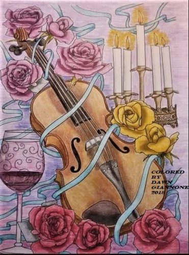 Done with assorted colored pencils. It was a beautiful drawing to color!
 The left half, I used brush markers, and the right half I used glitter gel pens. The background is done with soft pastels.
 Our valued fan Carla Strating also likes grayscale coloring pages. Here’s what she says about her recent grayscale accomplishments:
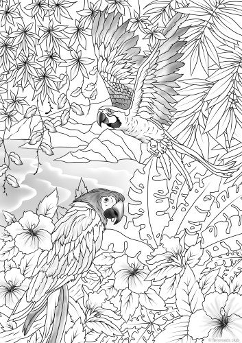
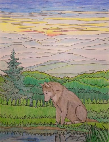
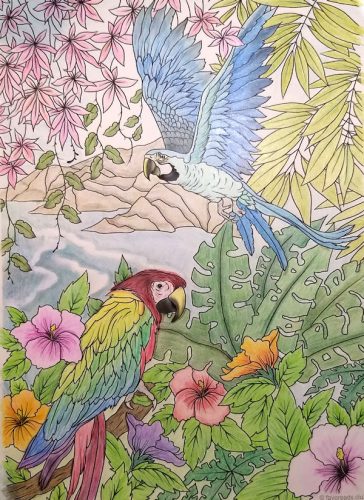
I use the grayscale to show me where the darker tones need to be in the picture. For instance, in the wolf picture, when I saw the mountains in the background, I saw the Smokey Mountains, where the haze hangs low below the tops of the hills. I also use it to guide me in giving more definition in a face, animal or flower. In the picture of the parrots, especially in the water, I used the shading to show me where the rest of the waves were and I used the shading to make the water color darker to help make the crests stand out. And again, it helped to designate more depth and details in the birds and flowers.
Grayscale artworks by Carla Strating
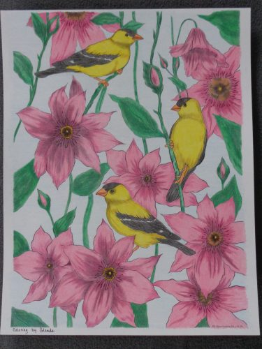
Grayscale artworks by Glenda Works
Glenda Works agrees that grayscale really helps her with the shading and highlighting. This is what she says about Birds and Flowers coloring page:
This one took me a while to color because I layered the colors: started with a light color on the flowers then shaded with a medium color and then enhanced it with the darker. Then went over it again with the lighter color to blend.
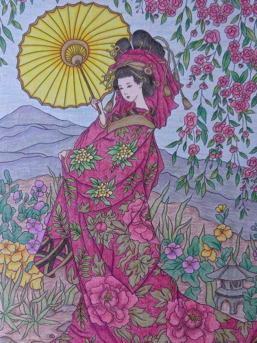
And this is how she colored Japanese Woman:
I loved this design. It is very detailed, but that is what makes it so interesting to color. I actually timed myself coloring this one and it took me a little over 13 hours to finish it the way that I wanted. I had the design copied onto textured cardstock which gives it a canvas look.
Summing it up
Grayscale coloring may seem more challenging than it really is. The main trick is to make sure your colors match the shades of gray that are already in the picture. Never stop experimenting with your coloring tools either. If you think that grayscale designs will limit your imagination, just give them a try and see for yourself that the gray tones are in fact very helpful.
Check our online collection of grayscale coloring pages HERE and start creating your new masterpiece. Don’t forget to SHARE this article and leave your COMMENTS below. Let’s see how many grayscale fans we have in our community!
I enjoyed reading this article because it clarified me some misunderstanding about greyscale coloring. Now I want to to try and I will do it!