


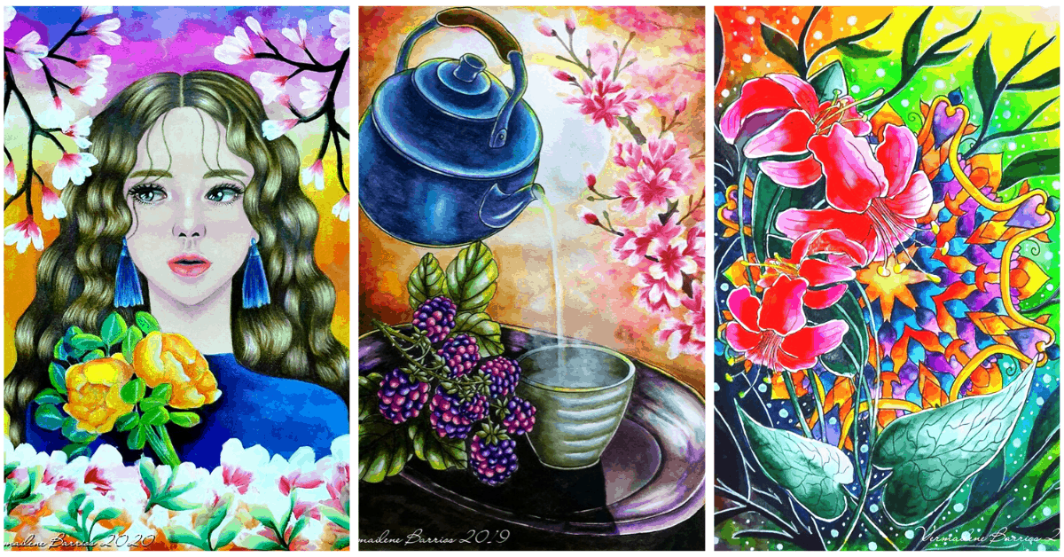
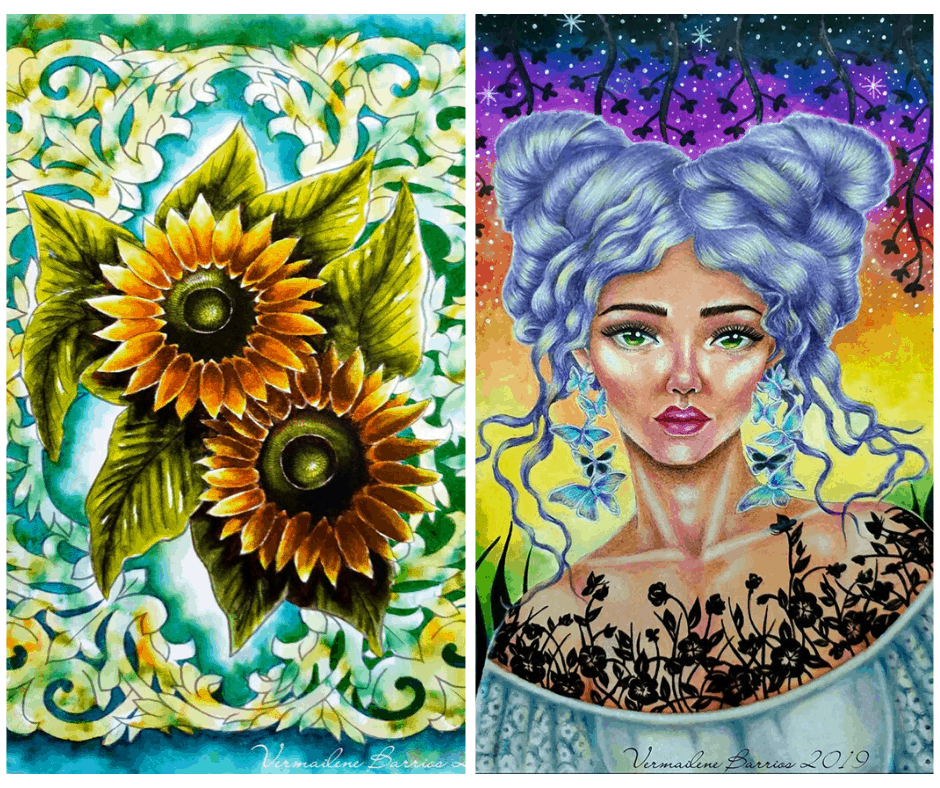
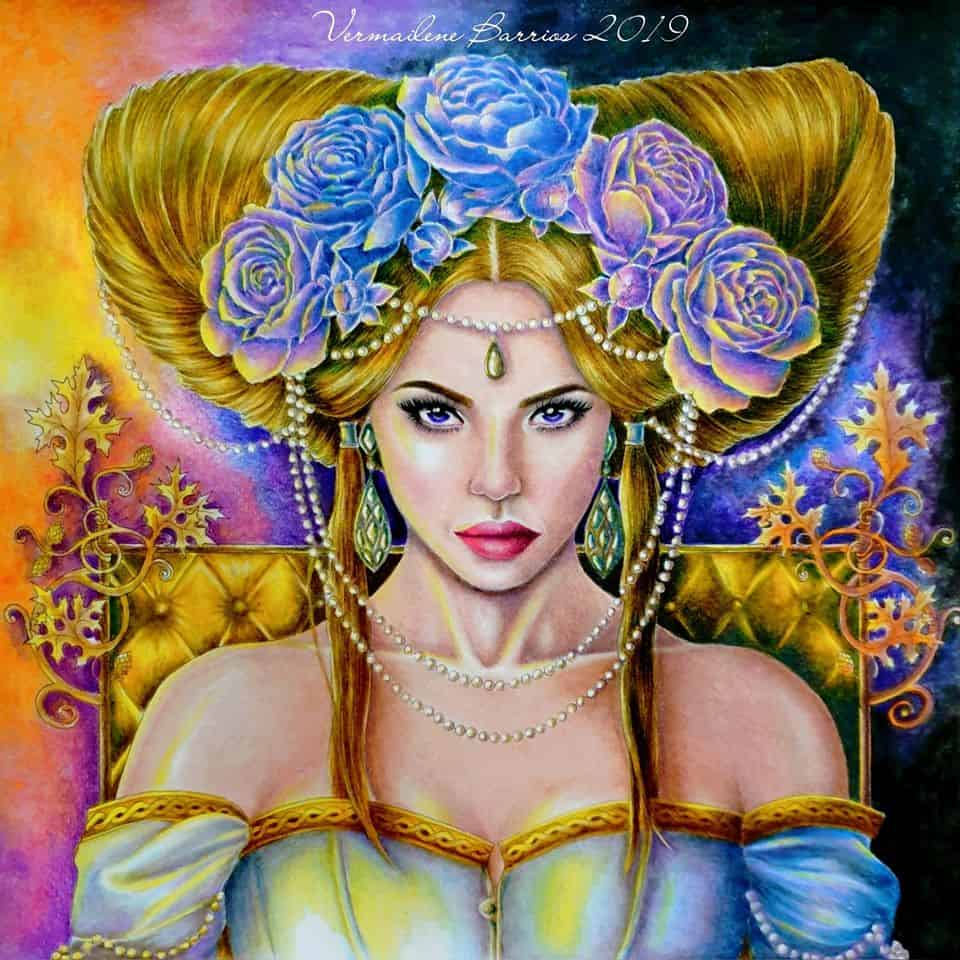
Colorists, we are ready to share something so cool with you! A fantastic coloring tutorial from a very talented colorist Vermailene Barrios ❤️❤️❤️
- Instagram: https://www.instagram.com/vermailenebarrios/
- Facebook: https://www.facebook.com/vermailene.deguzman/
- Favoreads: https://coloringart.com/artists/8078/
When we published her Sofa artwork, there were lots of questions on how she did it. So here is a video of the coloring process for you to watch and learn the technique!
Enjoy and let us know in the comments below if it was helpful and how much you liked it. Also, let’s thank Vermailene for all the work she has done for our coloring community!
Interview
Tell us a little about yourself. When did you start coloring and how did you learn it?
Hi! I’m Vermailene Barrios, a market research director by profession. I’m 37 years old, married to a very supportive husband. We have a dog son and we live in Manila.
I started coloring as a hobby back in 2015 when it became popular for adults. A good friend gave me a coloring book and thought it’s a good way to channel negative energy into something positive.
I started out with very basic patterns. No shading/ blending whatsoever. Then I began to see some incredible works from other colorists and I tried experimenting. I got to learn about new coloring materials and books as well. I think by profession, it’s natural for me to be curious and learn new facts and information, which made exploring new books and art materials very enjoyable.
What kind of designs do you like and why? What benefits of coloring do you experience?
My favorite designs right now are portraits. If you will notice in my Instagram account, 90% of my recent works are portraits. I also mention whenever I don’t color faces like my caption when I posted the sofa. Non-portrait works are a break from my usual experience, hence, I try it from time to time.
Coloring portraits challenged me at first. I’m always fascinated by those who can do it excellently and I wanted to be like them. So I learned through practice and through time I eventually became good at it.
I guess I’m also competitive by nature, I’m driven to become better and I always challenge myself to stretch. It leads to self-discovery and constant improvement of my skills.
What are your favorite coloring materials and brands?
While my favorite subject in coloring are portraits, surprisingly, my favorite materials are water-based markers.
Markers are easy on the hand as you don’t need to apply a lot of pressure for them to color. They are usually vibrant. I scan and print on watercolor paper to maximize their blending capabilities.
My favorite marker brand is Zig Clean Color. They have brush tips and a wide range of colors from very vibrant/ dark to very pale/ light, which is important to achieve depth.
I also use pencils a lot, especially for portrait works. I really don’t have a favorite brand for pencils, but my usual brands are Caran D’Ache Luminance and Prismacolor Premier pencils. They are fantastic for blending as they are soft. Again they don’t require much pressure to color vibrantly.
I guess I can say my hands aren’t that strong to withstand constant pressure of pressing down on paper, hence, I choose materials which are friendly on the hands.
I also print on good paper. That’s another luxury which in the long run can save our hands more. As mentioned, I transfer images to watercolor paper (scan and print) to maximize water-based markers blending capabilities. I use Fabriano or Canson 9x12in sheets. They come in 10s per pack. They are not as pricey as the artist-grade pads.
When I use pencils, I also use toned paper (tan or pink usually). The toned paper doesn’t need much pressure for pencils to color and blend. I find it easier to even out skin tone and layer on this kind of paper. I usually use Strathmore Artagain (it has several paper tints), Strathmore Toned Tan, and Clairefontaine Naturel papers. Moreover, when you print on toned paper, it’s easy to cover the black lines with pencils. So the end result is like a painting.
Where do you find inspiration?
I find inspiration in random things. Whatever I see around or on the Internet. My recent work of the mermaid with the spotlight under the sea is inspired by a random shadow cast on the paper when I was about to color it.
So I really don’t think about it much. And I’m sure you’ll be surprised that I’m not planning the outcome of the page. I just go with whatever happens while I’m coloring. Like the sofa, I didn’t plan it to be in an evening setting with a light source. When my friend and I did a color along for that page, we agreed that it will be stress-free, not much thinking. Well, I got carried away in shading as I was a bit frustrated with the vibrancy of the watercolors I used for it. So I layered several times to achieve the depth I wanted, resulting in a very dark room. So then I decided to add the light source for a more realistic feel and made it an evening setting.
What are your top 3 tips for a beginning colorist?
Tip #1: Just enjoy. Don’t stress about it and don’t compare yourself to others and feel bad about it. If you can’t stop yourself from comparing your skills to others, then do something to make your skills better by practicing and learning.
Tip #2: Open your mind and observe. When you look at a picture, a setting, or a scenery, train your eyes to identify the light source, shadows, mid-tones. This is key when you want to achieve depth in your coloring works.
Tip #3: Take care of your hands. While you may feel that I spend a lot on materials, it’s also my way to preserve my hands. Future medical bills may be more expensive than the high-quality materials you buy so you can have a better coloring experience.
What do you think are the easiest types of designs to start with? Like “people”, “animals”, “mandalas” or something else? What did you start with?
For beginners, patterns or flowers can be the easiest to start with. You can practice blending and shading then you can move on to animals and then people. To achieve more realistic coloring, you can use picture references. You don’t need to imagine everything.
What techniques do you usually use? (Such as shading, blending and etc.)
I like shading a lot. As you may notice the level of depth in my coloring works. But of course, with shading, I tend to end up with very dark or high contrast works. So vibrancy is not only achieved through vibrant coloring materials. You can have the dullest set of pencils but you can still achieve vibrancy by making the shadows very dark and leaving highlights very light/ white.
Could you please tell a bit about using watercolors. What are your tips for those who want to try coloring with it?
I’m not an expert in watercolors but it’s a very challenging coloring material. The trick in using them is layering and patience. Haha! If you are short on time and you need to color fast, this is not the medium for this situation.
I recommend good paper, please use watercolor paper as that is made with cotton/ plant cellulose which holds water very well which enables you to spread the paint/ pigment. Non-watercolor paper tends to absorb the water quickly so the pigment drops on the paper immediately without enough time for you to spread it. Also, don’t get frustrated with watercolors as it’s a medium you should not force to control. If there are 2 types of medium to be plotted on opposite sides of the pole, watercolors will be on one end and pencils on the other end. Embrace the looseness of watercolors and you will love them.
How do you color people? Any tips for coloring hair and skin tones?
Coloring hair and skin requires different kinds of strokes. Coloring hair requires the flick motion so you can mimic real thin hair strands. Coloring skin requires blending and layering. Usually, I lay down the shadows first, very light pressure, then blend it with mid-tone colors and then lastly, the lightest one/ highlights. You can go back to deepening shadows, blending until you achieve the depth you like. This repetition of steps contributes to the level of depth and detail you like to achieve.
How Did You Like This Tutorial?
Did you learn something new from this interview? What was the most interesting part for you? If you have questions or want to thank Vermailene for her story and tips, leave your comments below.
I really loved this tutorial and the tips! I am such a huge watercolor fan! Thank you so much for sharing, Vermailene, I really appreciate it☺
That’s very beautiful
Esse tutorial é simplismente maravilhoso. Sou nova no mundo de colorir e fiquei apaixonada. Parabéns para essa artista.
Really excellent and helpful. Thank you so much!